Trend Reports Freya Gaskell · Colour Report

CPHFW
Colour Report

Spring/Summer 27 · Copenhagen Fashion Week

The Spring/Summer 27 colour direction from Copenhagen Fashion Week. A seasonal colour report drawn from the CPHFW runways — the key colours, neutrals and combinations defining the season, with Pantone references throughout.

Ten colour stories run through the season: optimistic brights, botanical greens, sun-bleached naturals, aquatic blues, bubblegum, monochrome, soft neutrals, washed pastels, earthy taupes and burnished browns.
Cover
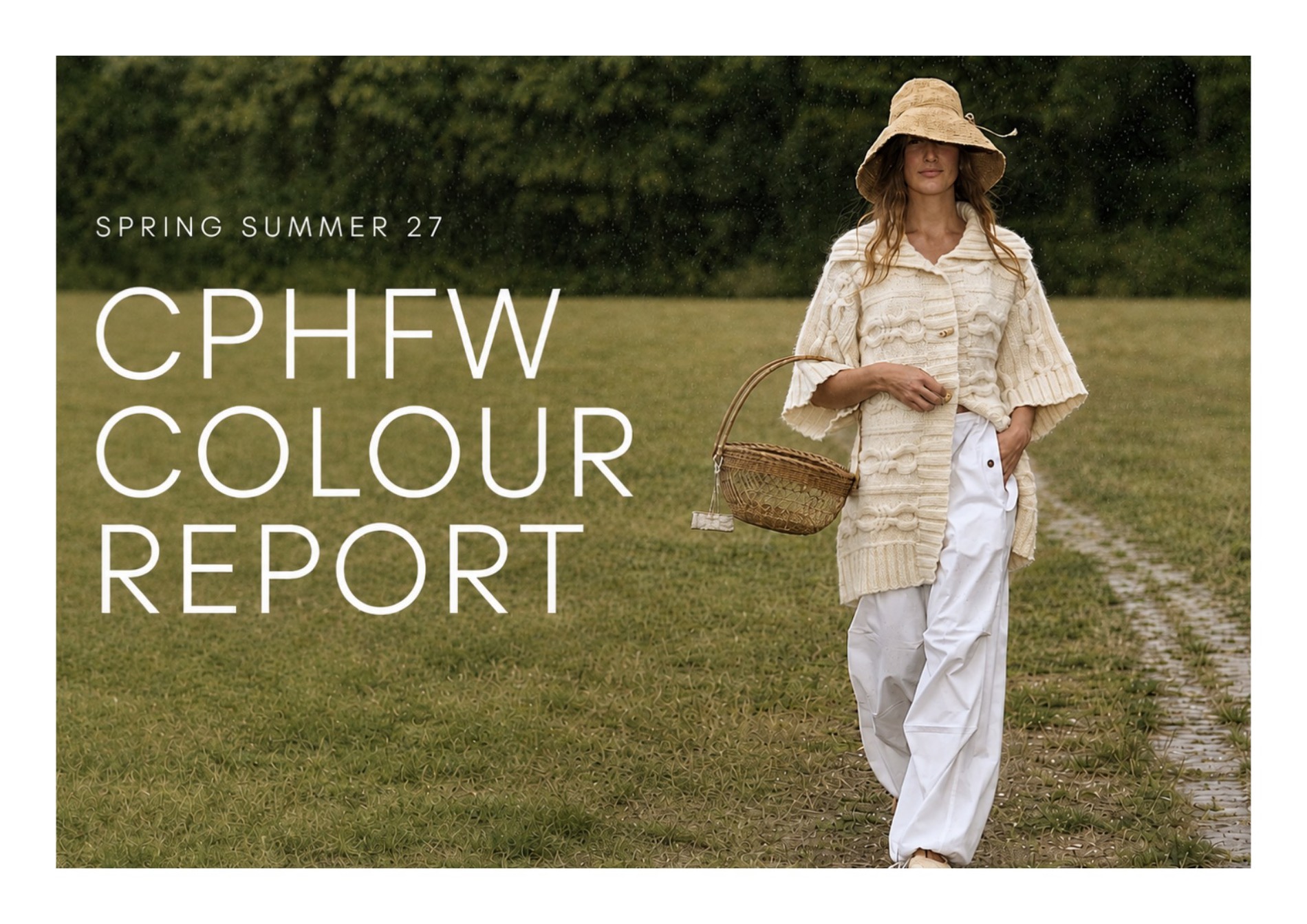
CPHFW Colour Report Spring/Summer 27 — cover
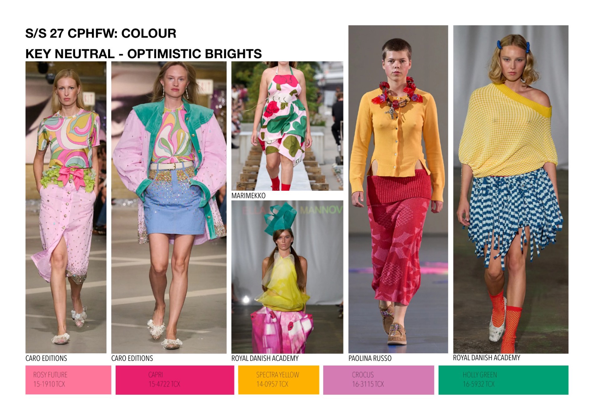
Key Neutral — Optimistic Brights
Key neutral — optimistic brights, with Pantone references
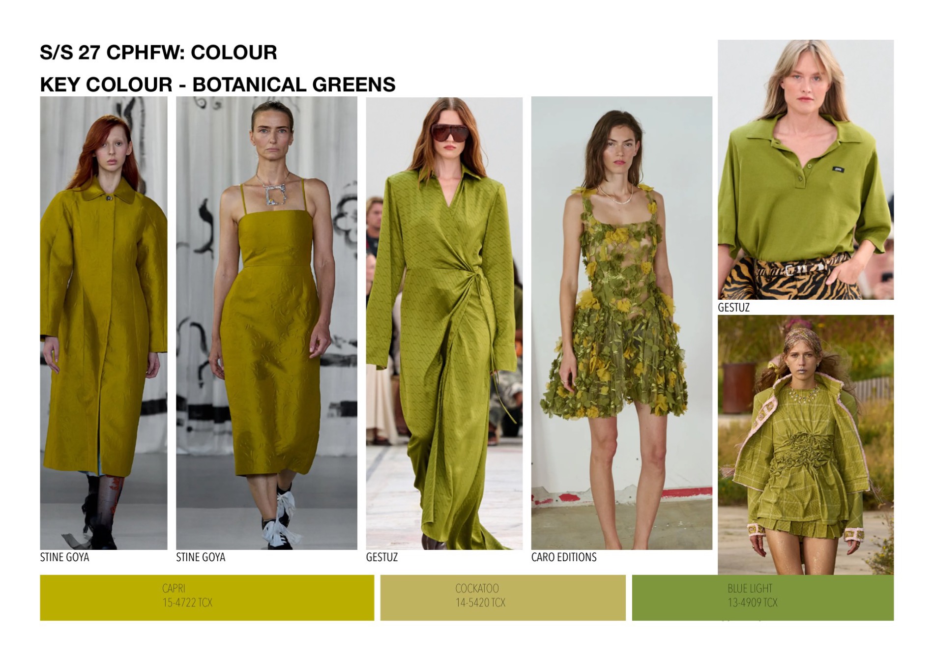
Key Colour — Botanical Greens
Key colour — botanical greens, with Pantone references
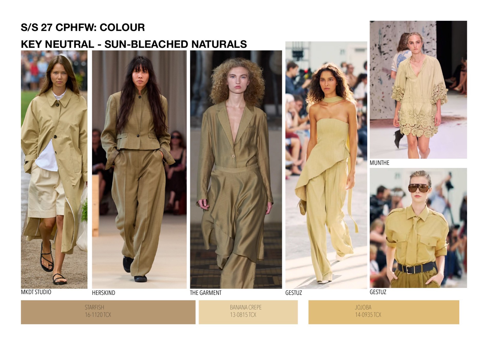
Key Neutral — Sun-Bleached Naturals
Key neutral — sun-bleached naturals, with Pantone references
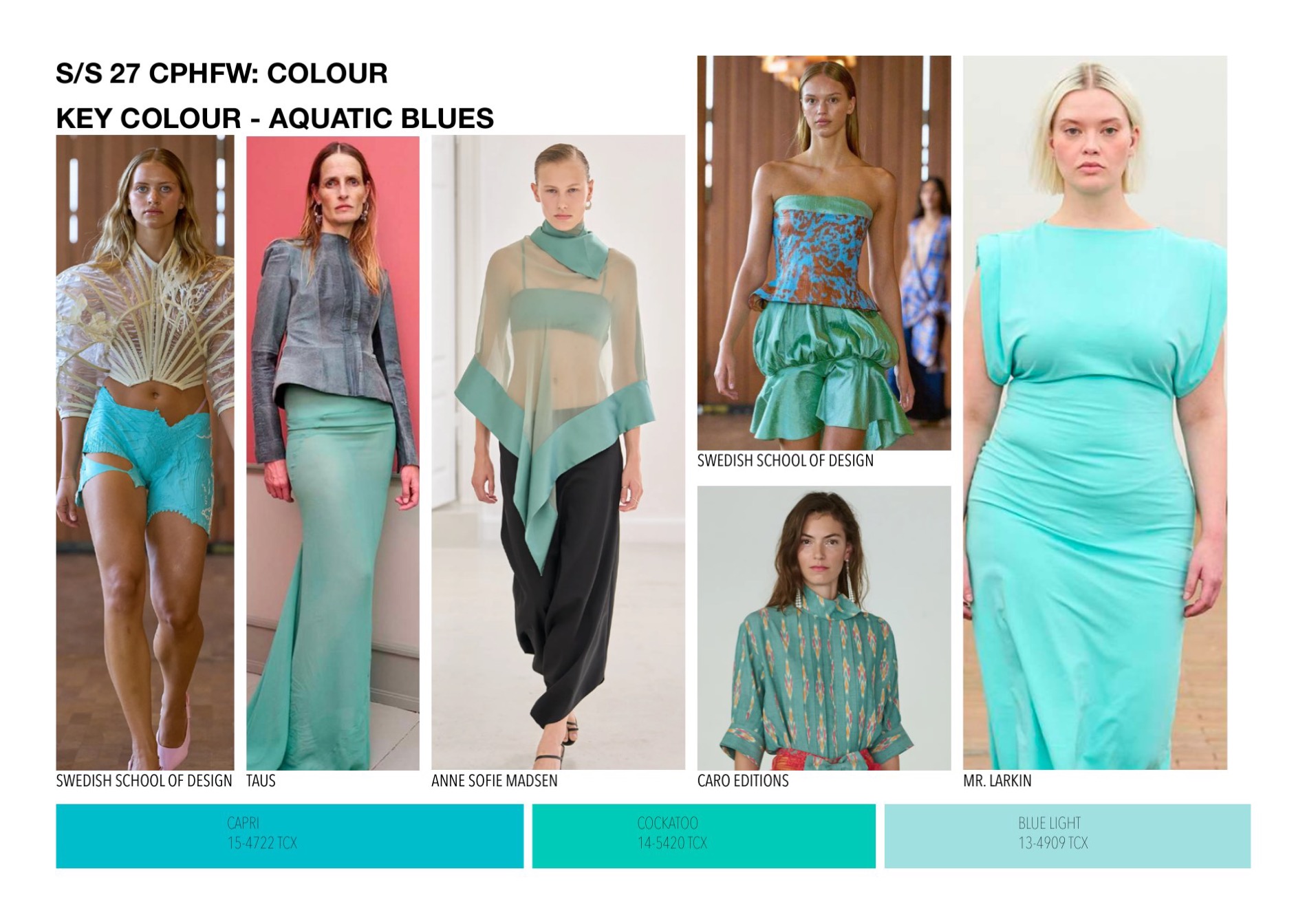
Key Colour — Aquatic Blues
Key colour — aquatic blues, with Pantone references
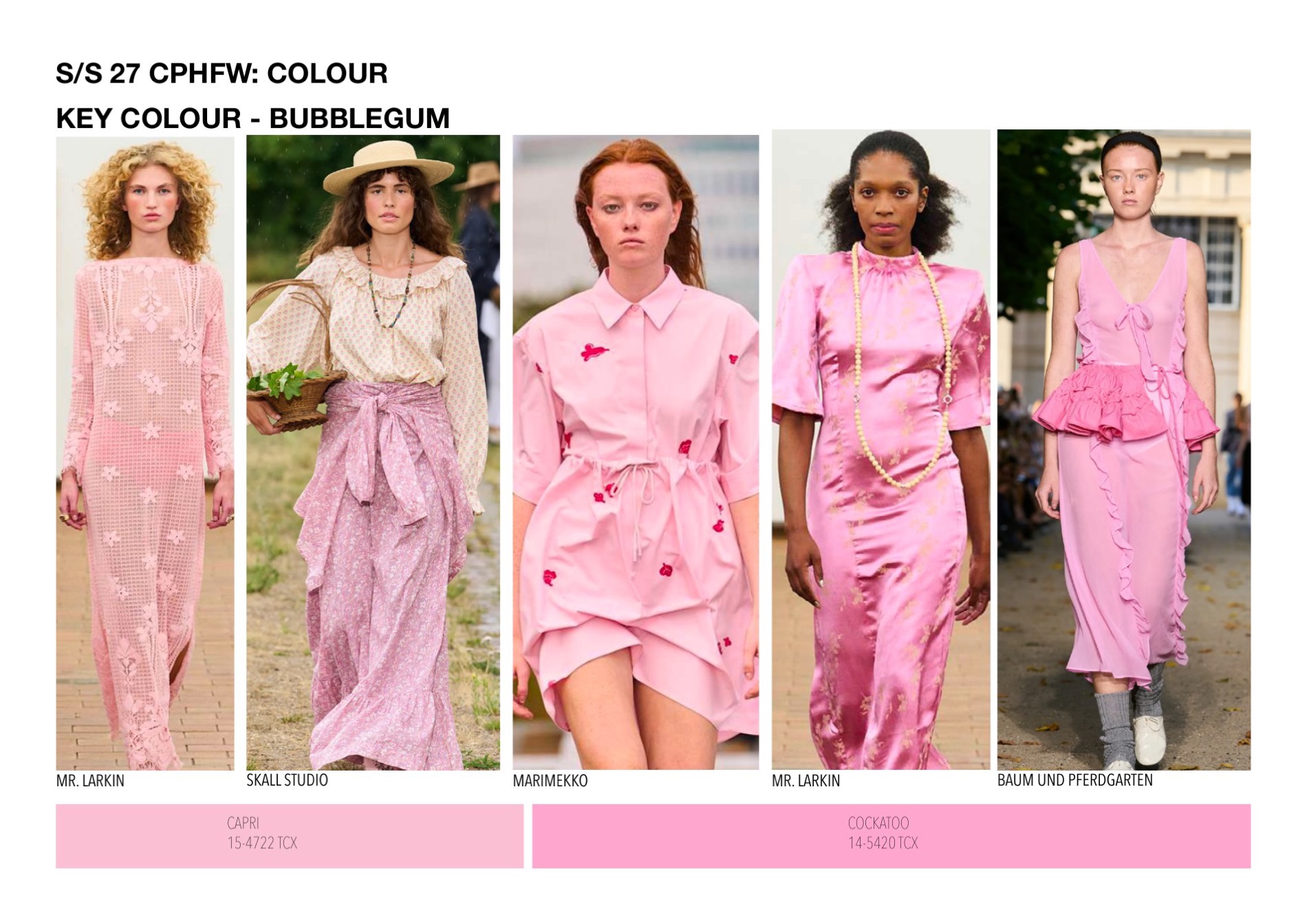
Key Colour — Bubblegum
Key colour — bubblegum pinks, with Pantone references
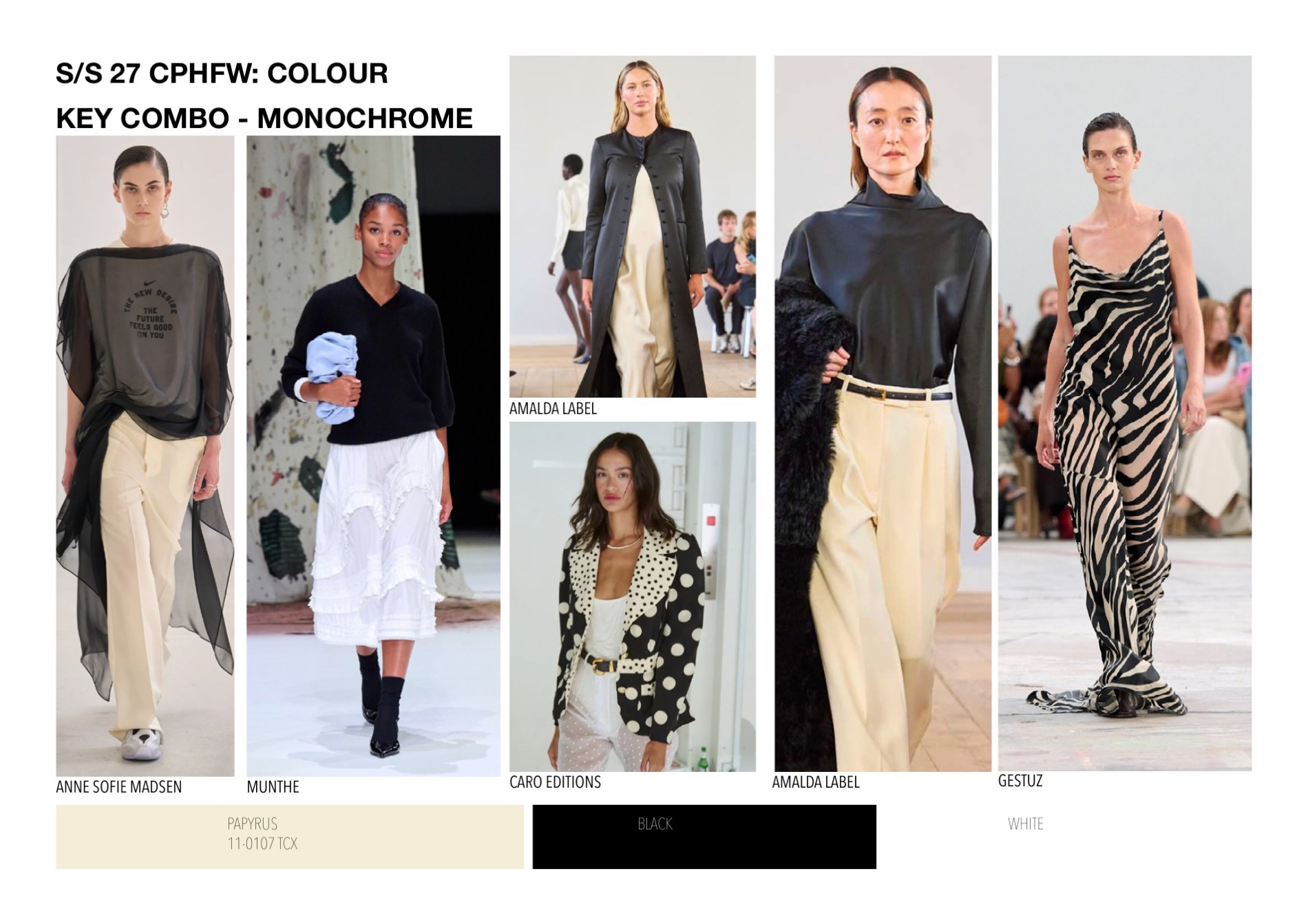
Key Combo — Monochrome
Key combination — monochrome, with Pantone references
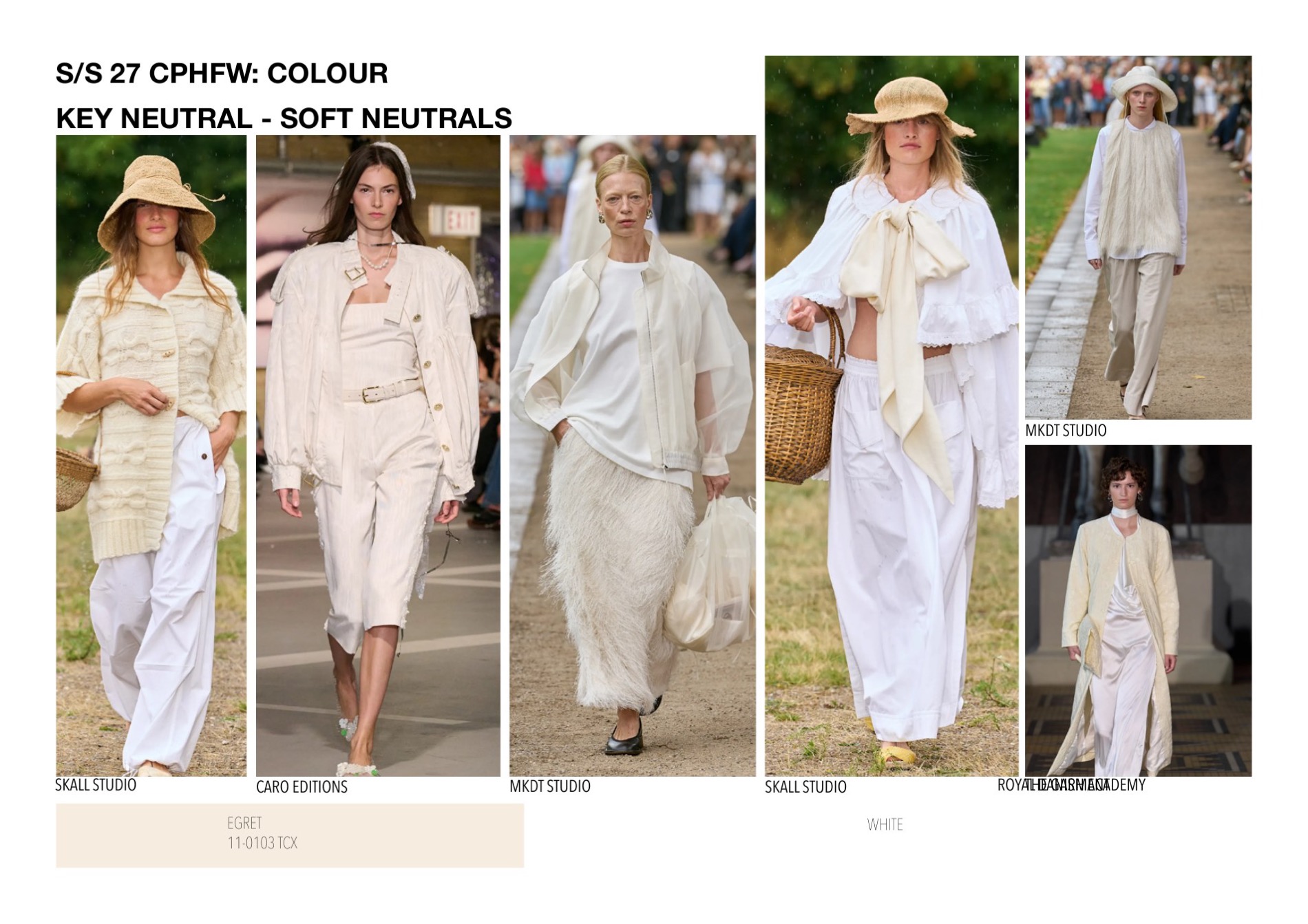
Key Neutral — Soft Neutrals
Key neutral — soft neutrals, with Pantone references
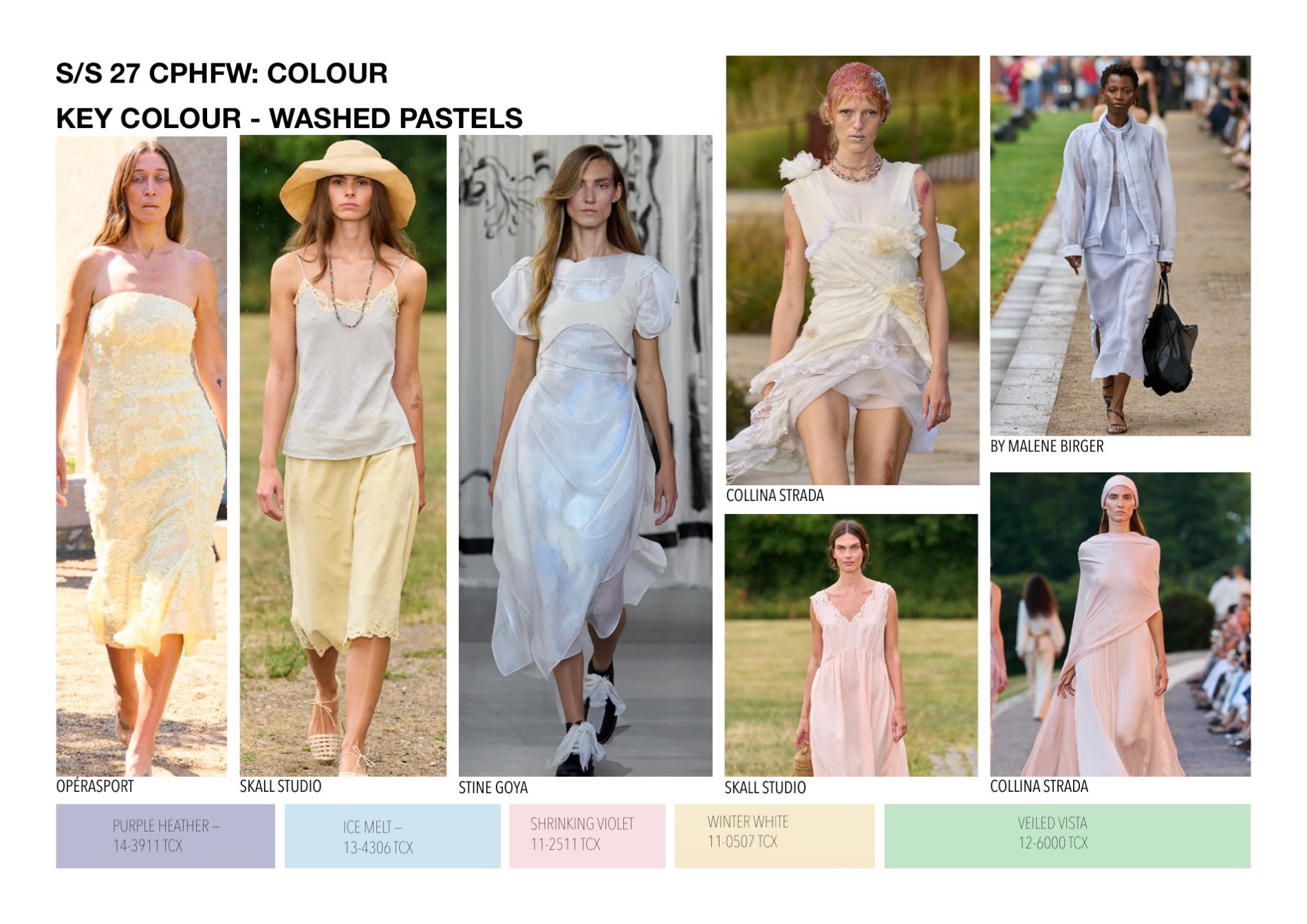
Key Colour — Washed Pastels
Key colour — washed pastels, with Pantone references
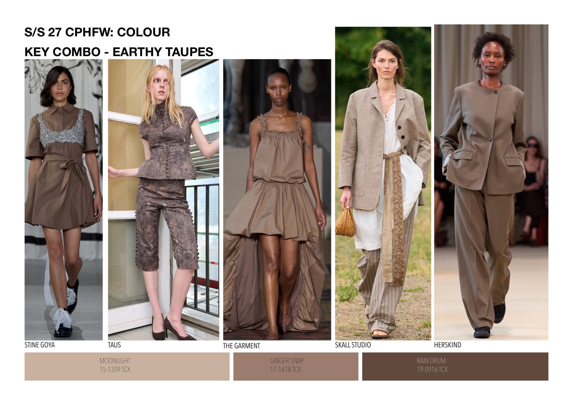
Key Combo — Earthy Taupes
Key combination — earthy taupes, with Pantone references
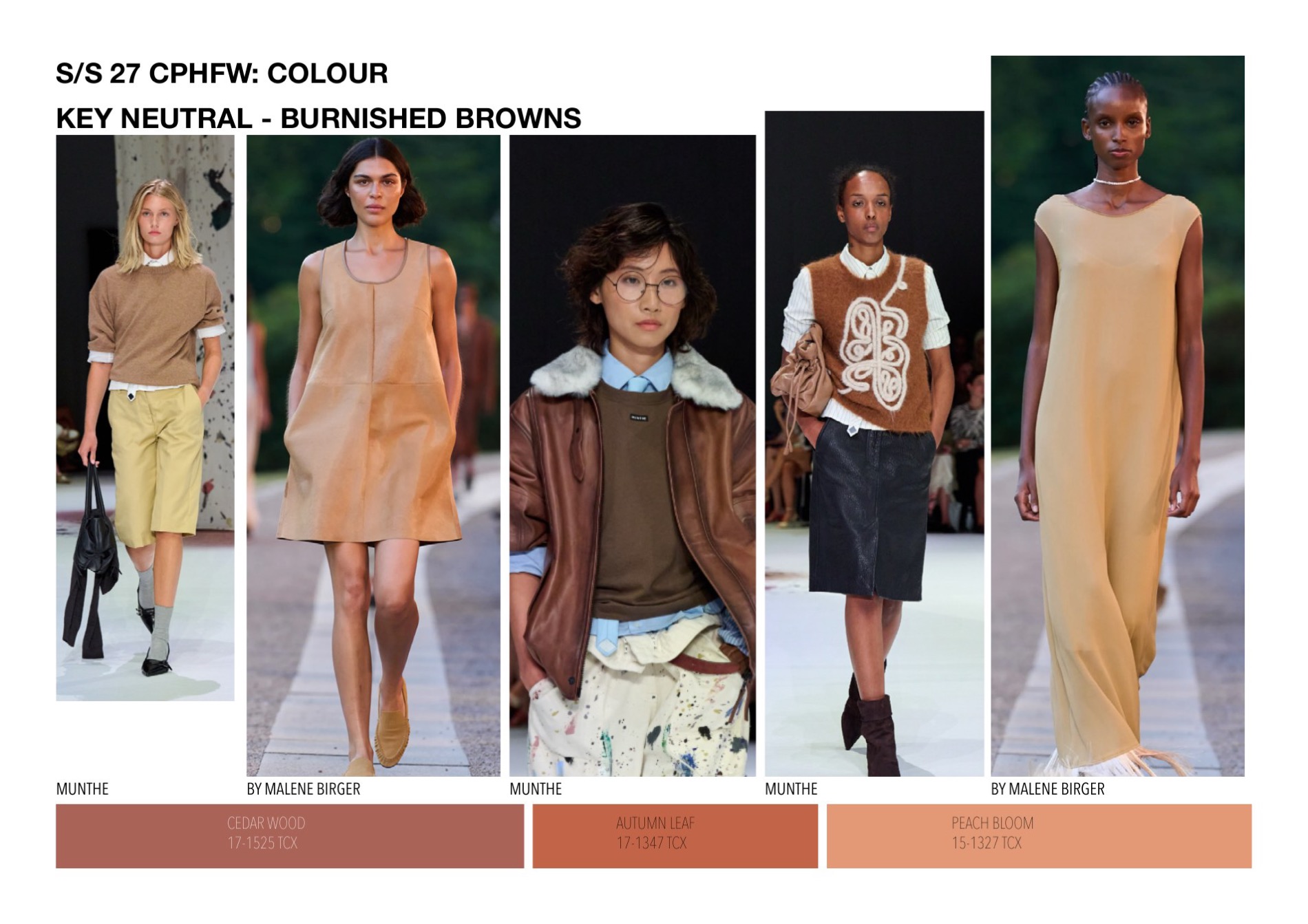
Key Neutral — Burnished Browns
Key neutral — burnished browns, with Pantone references